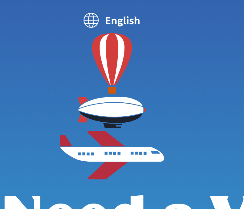
Do I need a visa?
UX, UI
I asked that question while discussing travel plans with a friend. What came next were a series of Google searches ending in frustration from horrible web experiences and confusing information. So I thought, "It shouldn't be this hard."
So I started looking around to see what was available...
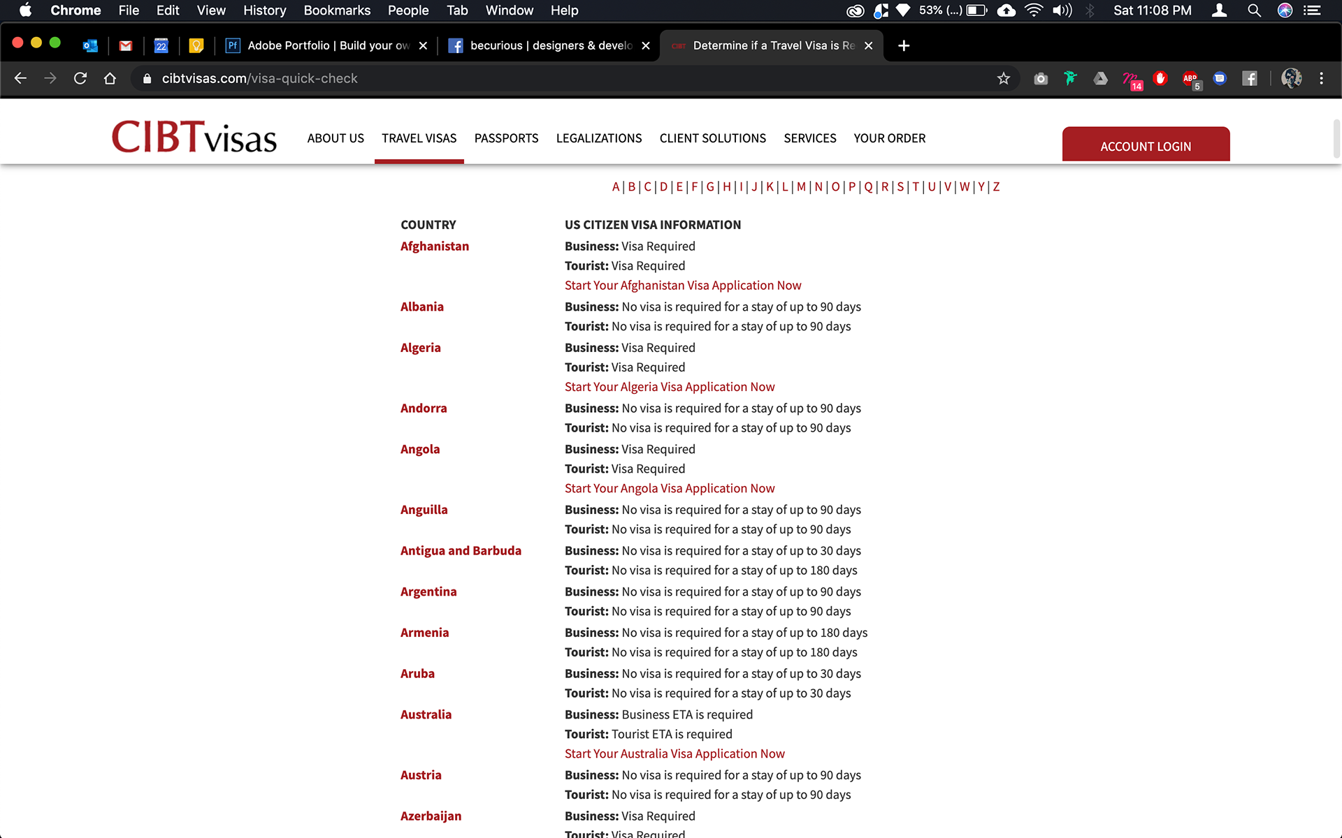
Got the job done but not appealing
Easy but very utilitarian
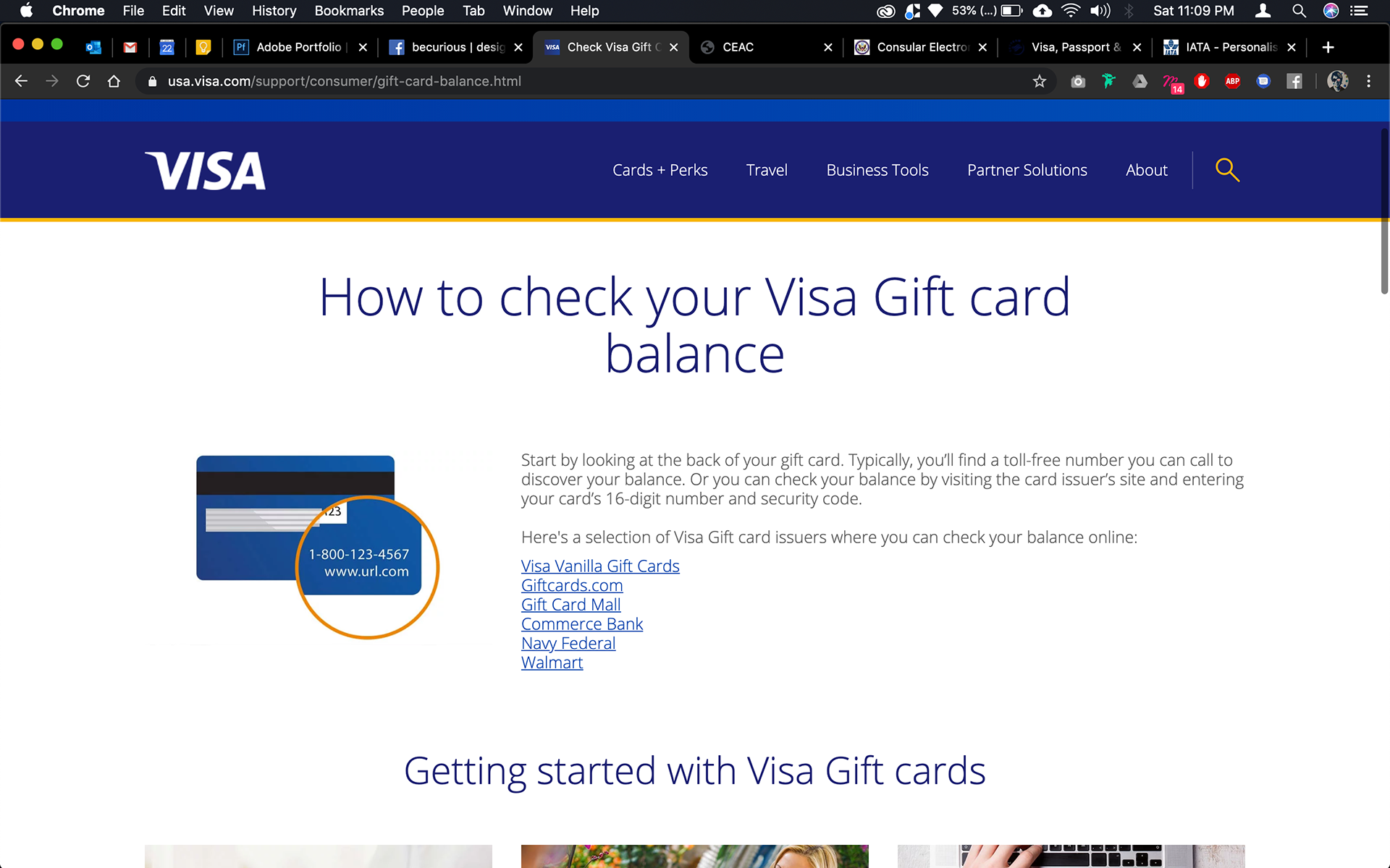
Should have added -creditcard to the search
Most of them got the job done but looked very plain. Many of them also offered to file visa applications which felt super sketchy since the sites felt like no one cared. That doesn't inspire confidence.
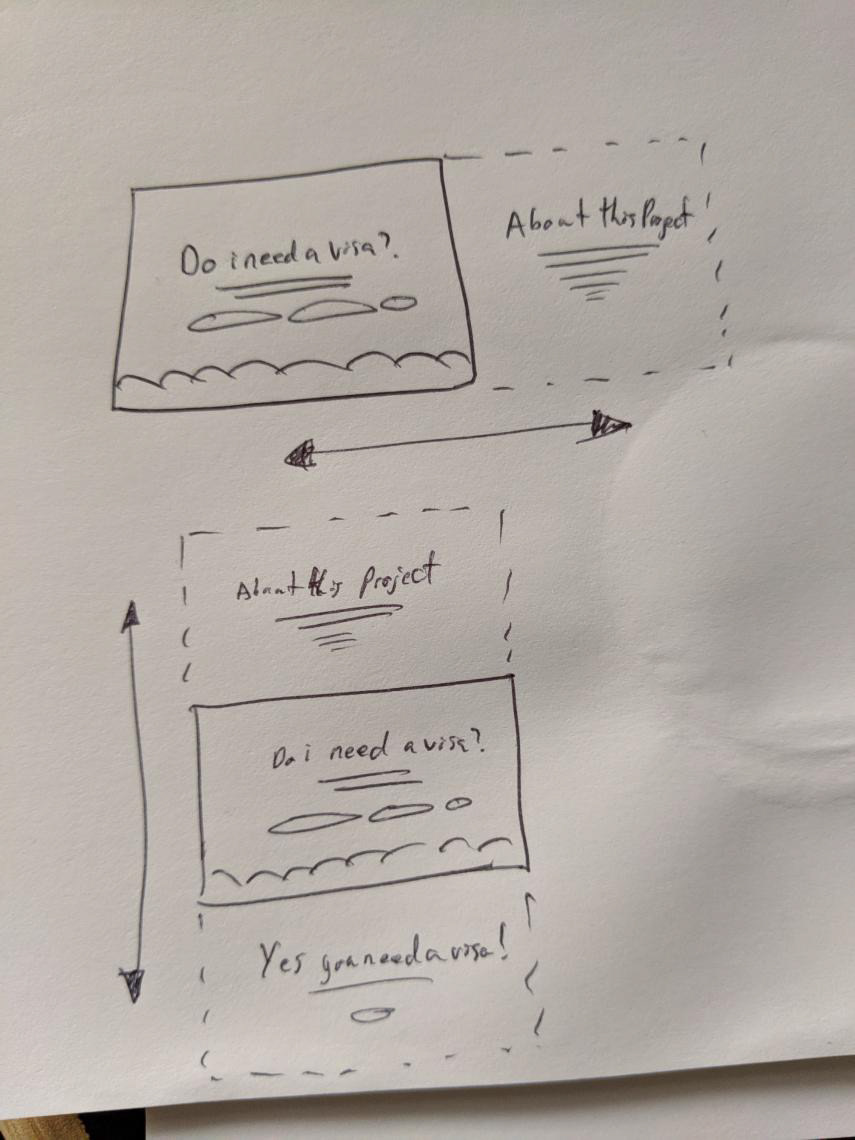
From there these were the essential features identified:
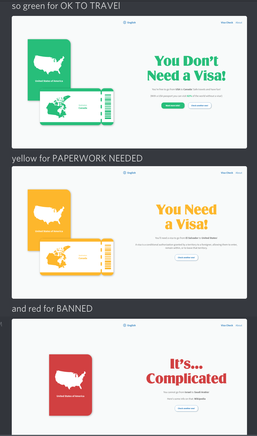
- JUST TELL ME IF I NEED A VISA
- Link users to more visa information if available
- Amp up the design to evoke travel feels
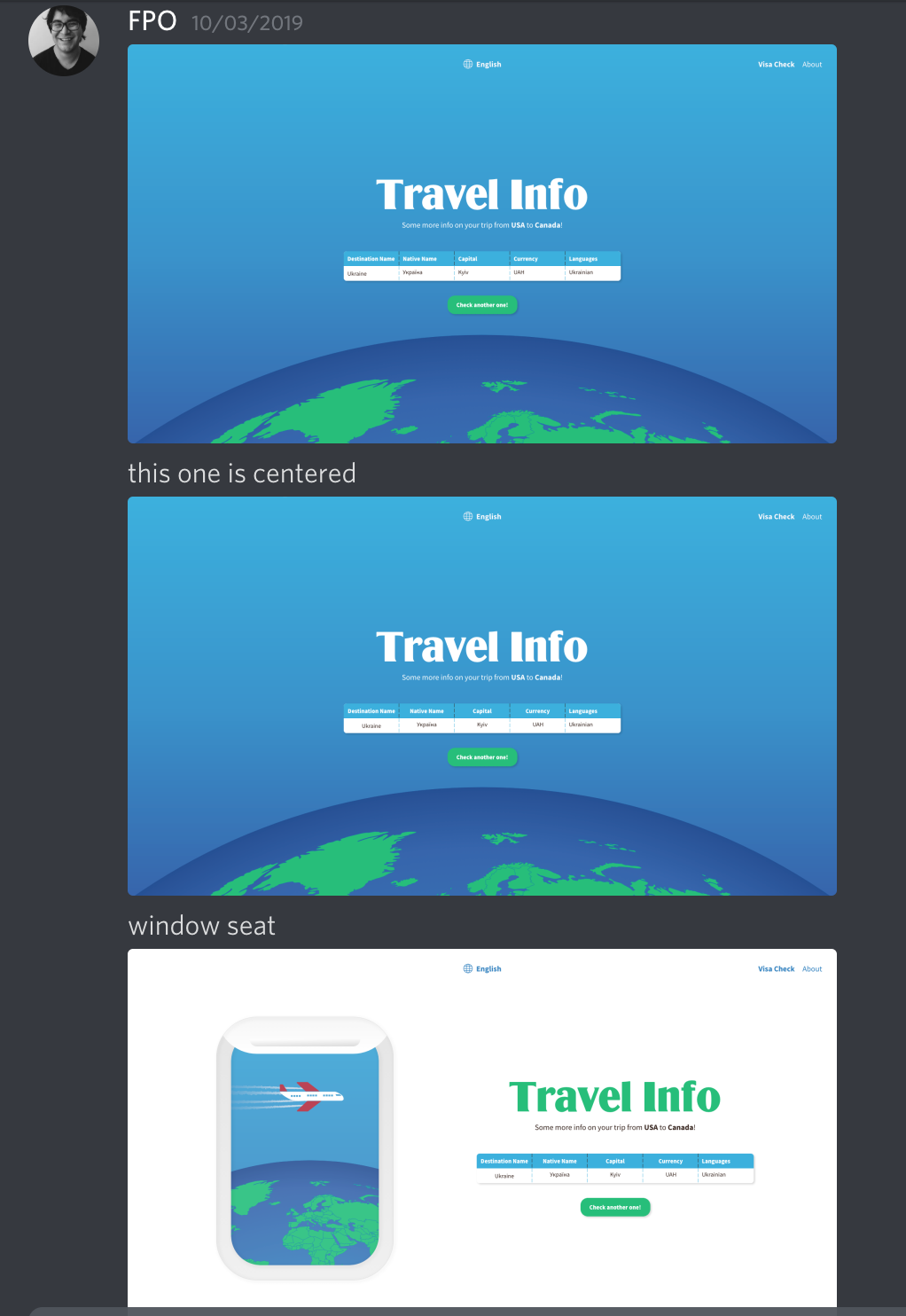
So a few hours later and some fun with auto animate on Adobe XD... I got a proof of concept video:
The response was pretty good but one comment in stood out.

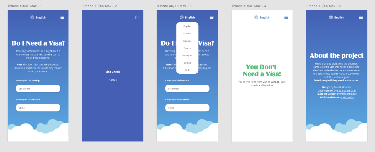
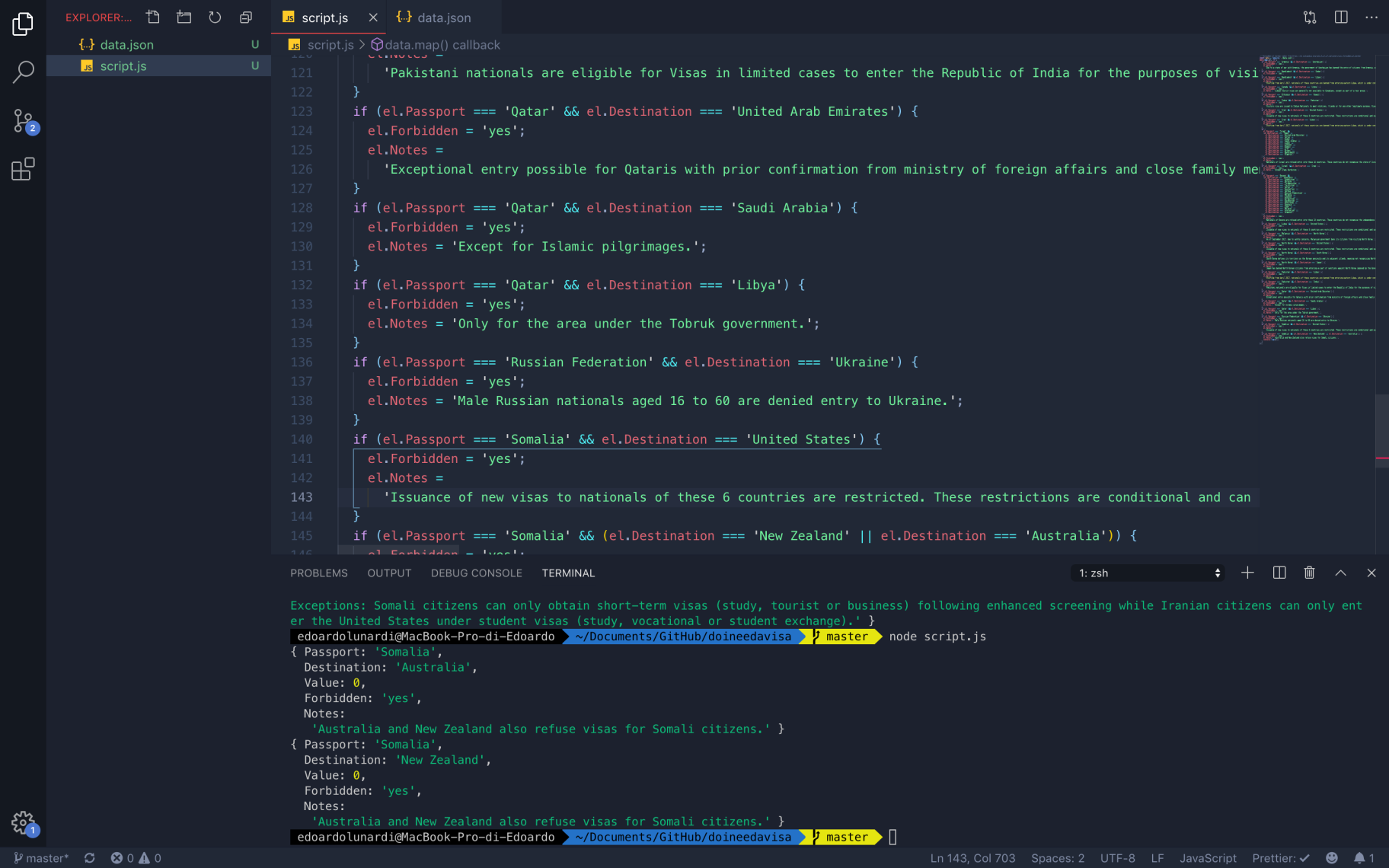
Edoardo and I decided to collaborate and build it out. From there on we added a few features and worked on transitions to make the user really feel like the trip is happening.
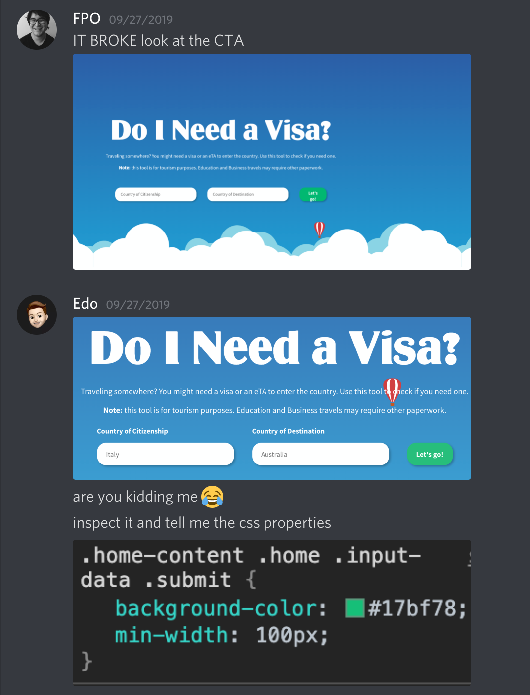
The good news? We built it and it was live! The bad news? The repos broke so everything broke. You'll have to take our word for it, it was awesome. Oh it also worked on mobile.
Here's the link in case we fix it. Otherwise sorry to waste your click *cries*
Here's the link in case we fix it. Otherwise sorry to waste your click *cries*
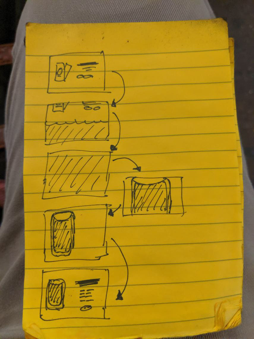
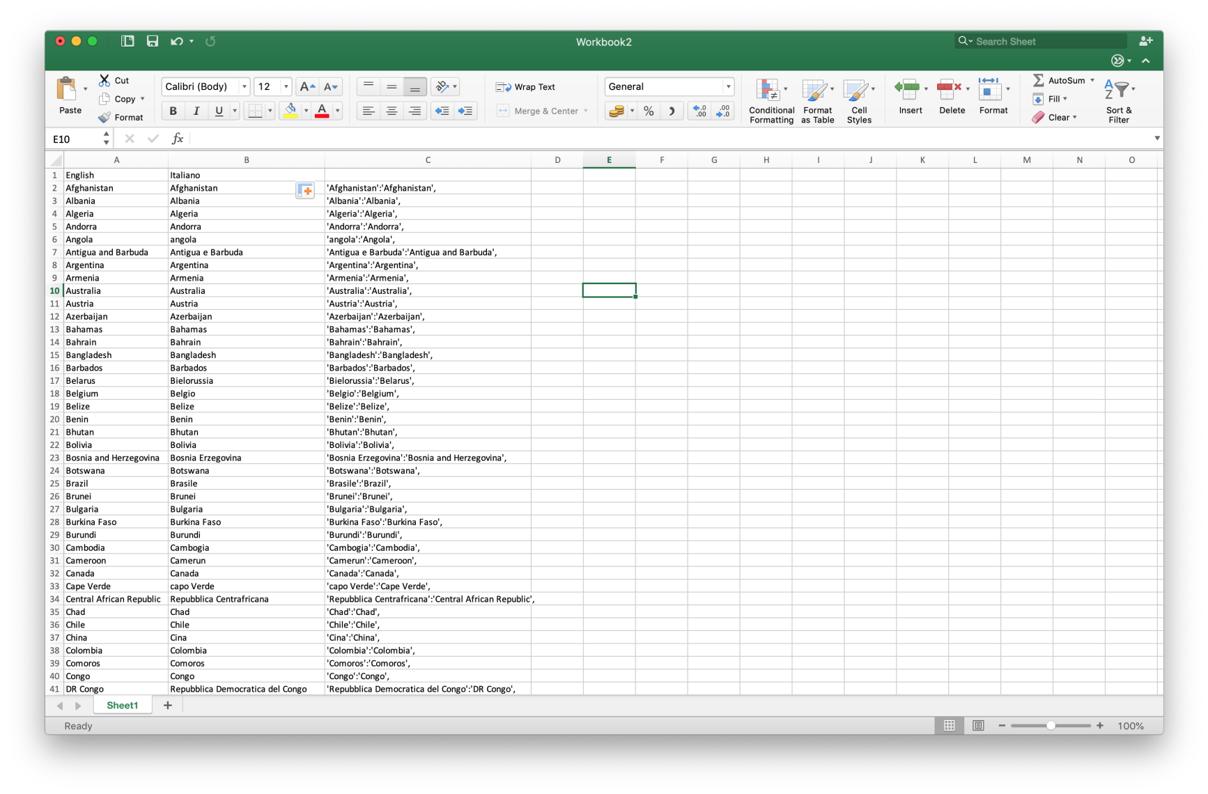
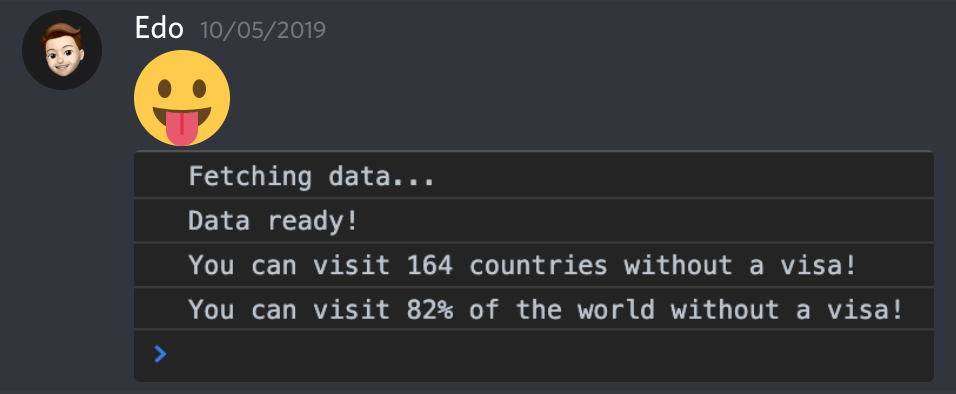
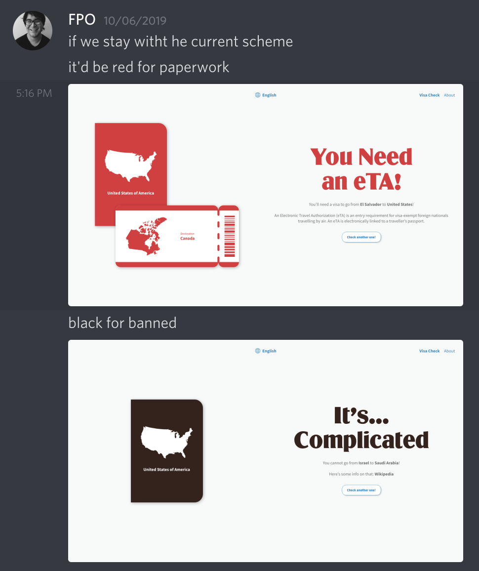
Oh and some fun process stills below in no particular order: